Using a heat map to analyze your Amazon sales
A heat map is one of the most useful Amazon sales analytics tools you can have as a seller. In this post, we’ll show you what heat map is and how you can use it for tracking sales on Amazon and making informed decisions for your Amazon business.
What is a sales heat map?
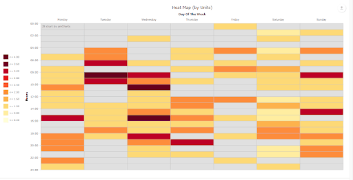
A heat map represents data in the form of colors, with darker colors implying “hot” or higher values and lighter or “colder” colors signifying lesser figures. When paired with sales data, you get a sales heat map.

In SellerLegend, the Sales Heat Map shows hourly sales for each day of the week in a selected time period using colors. The darker the color, the more the sales in that specific time slot of that particular day. For instance, in the image above, Wednesday’s 10:00 slot shows that the sales were a lot greater compared to other days for the same time slot.
Using insights from sales heat map analysis
As an Amazon seller, having a sales heat map can greatly simplify the task of Amazon sales tracking and business analysis. Firstly, it’s convenient. Imagine just looking at a simple chart and knowing what day and time you get the most sales. Secondly, while the information may look simple, it can help you make better business decisions that can increase your Amazon sales and cut your losses.
Let’s say you get most sales of the week on the first three days, and the rest of the week is relatively slow. You can spot the fast-moving days at a glance on the heat map by identifying the days with the darker colors and the slow ones with the lighter colors. But how can this piece of information help you make any decisions? Well, if you get creative, you can put up promotions on the slower days of the week, especially if that has been the pattern for a while now. This will let you sell more than you normally would on your down days.
You also now know, just by looking at the heat map, that even without promotions you sell a lot more on the first three days of the week. Then you don’t have to put up promotions on those particular days. This way, you’re able to optimize your promotion budget by spending only on the days where it’s absolutely necessary.
There’s a lot more that can be accomplished through the heat map. You can compare the same time frame (such as the same month) for different years and see a pattern for how your sales have varied for that time frame (i.e. month). This can help you make better, educated decisions with your business. For instance, if you notice an overall downtrend for the sales of a particular product, that could indicate declining demand. Depending on your business model and goals, you might want to start looking into the factors that are contributing to the sales slump so you can address them. Or, you might seek out other products that have better demand and growth potential.
You can also better manage your Amazon inventory this way. If you know that each year, you make little to no sales for a few months following December, but also restock around the same time, then you know there is no point in restocking in that period. You can avoid restocking up until the month where you know your sales get back up again. This can help save much of the storage fees Amazon charges you, which increases as your products spend more time sitting on FBA centers.
The sales heat map is just one of the many tools you can use for tracking and visualizing your Amazon sales. Having these Amazon analytics tools is a must if you want to make your life easier as an Amazon seller and business owner.
Let us know in the comments if you found this post useful!
P.S. If you’re interested in seeing the difference that having an Amazon analytics tool suite makes, you can sign up for a free trial of SellerLegend.